Menu
Idea: One Lutens, One Bond
Our new sub-brand, named "Origins," will weave stories of human connections with their roots, capturing memories entwined with land and culture. Embracing the concept of "One Bottle, One Bond," Origins will craft niche fragrances, each reflecting the unique cultural hues of different countries and regions.
This endeavor not only brings to life diverse cultural essences but also pays homage to the genesis of the parent brand and its founder, Serge Lutens.

Selling
The product we are selling under an imaginary subsidiary branch from Serge Lutens’ perfume line called Origin. Different from those stereotypical perfume, we are focusing on connecting our users with their memory, specifically about their cultural background and the scene of their “Origin”. Hence the name “Origin”.
Connection
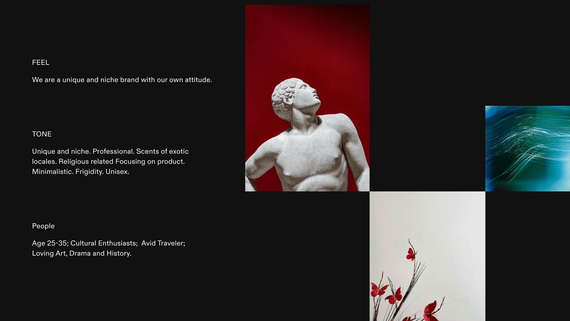
People who are looking for a product that can help them define themselves in the public. As our product is a new trend in the industry, we will target our audience from 20 to 35. They can be rich students who are looking to express themselves in a unique way. They can also be working professionals, who are looking for a more subtle and memorable appearance.
Persona
Sophia Martinez, a 32-year-old cultural anthropologist from San Francisco, embodies the ideal "Origins" customer. Passionate about world cultures, art, history, and travel, she seeks authentic, meaningful experiences in both her professional and personal life. Sophia values unique, culturally rich products that tell a story, aligning with "Origins'" ethos of creating fragrances deeply rooted in cultural narratives. Facing the challenge of finding genuine cultural representations, she finds solace in "Origins'" ability to transport her to different places and times through its unique scents. Each fragrance from "Origins" is not just a perfume for Sophia; it's a diary entry from a beloved or anticipated destination.

It's Origin
Combining the profound use of red in Serge Lutens' early works, reminiscent of the dawn's first light, with the ethos of 'Origins', creates a symbolic parallel. The red, much like a rising sun in Lutens' creations, embodies a sense of deep mystery and allure. This mirrors the essence of 'Origins' – a brand that symbolizes the awakening and connection to one's cultural roots. Just as the red in Lutens' work captivates and draws one in, 'Origins' invites people to explore and connect with their cultural heritage, offering an enigmatic journey through the world of fragrance. This symbolism of beginnings and discovery is at the heart of what 'Origins' aims to represent.
Allow new design to exist effortlessly
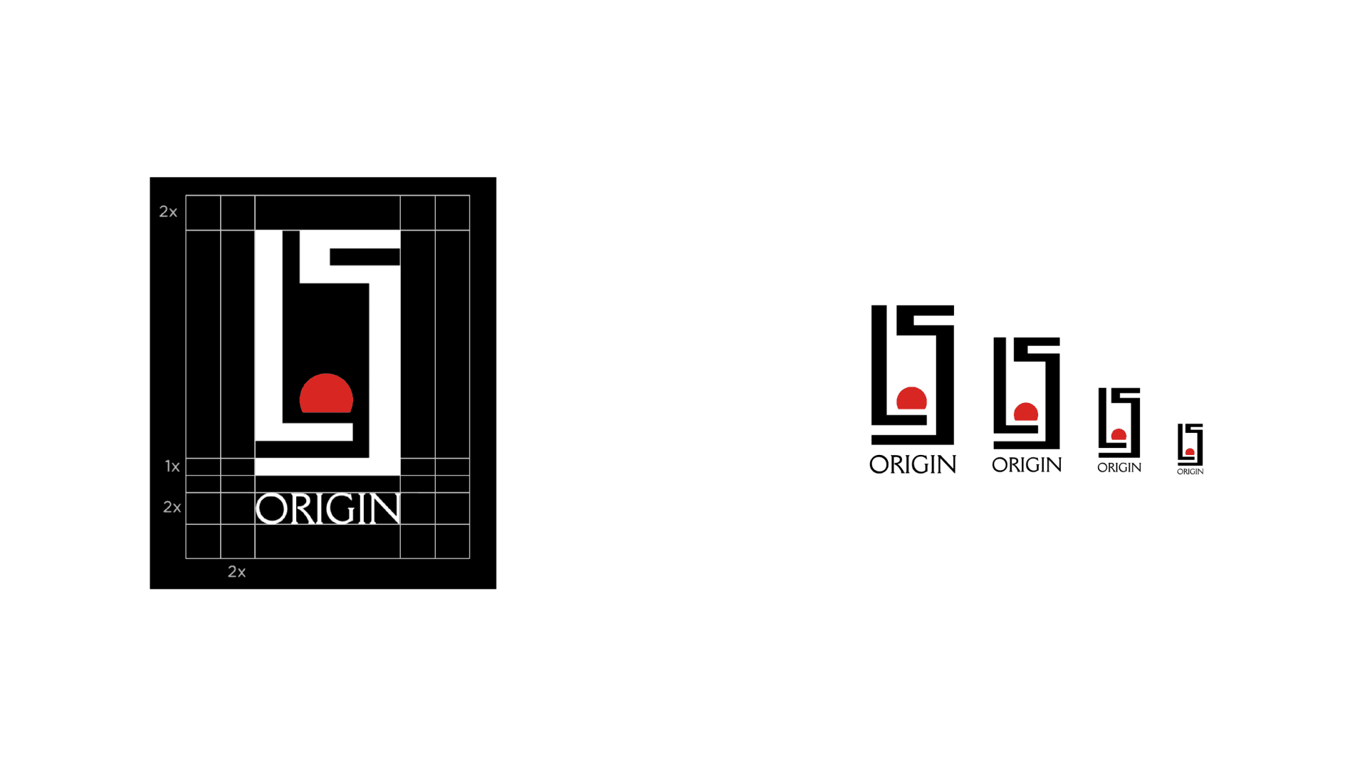
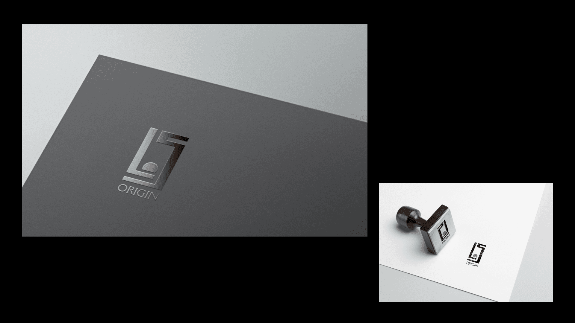
In designing the logo for 'Origins', I chose to retain key elements of the parent brand's logo to leverage its established brand equity and influence. This approach facilitates an immediate sense of trust and familiarity with the new brand.
Additionally, I subtly refined the positive and negative space of the original logo to achieve a more harmonious and balanced design. Central to this logo is the motif of a nascent sun, symbolizing the dawn of origins.
The red semi-circle will serve as the new visual anchor in the logo, with its striking shape and color contrast designed to deepen and solidify the brand's impression in the minds of users.


Typography
Selecting the humanist serif font Della Robbia as the brand's typeface reflects my choice to infuse historical depth and richness through its engraving-like characters. This font harmoniously blends classic elegance with modern flair, aligning with the brand's fusion of traditional and contemporary designs. The readability and unique character of Della Robbia enhance the brand's identity, ensuring a memorable visual impact that resonates with the brand's narrative.
Origin Package
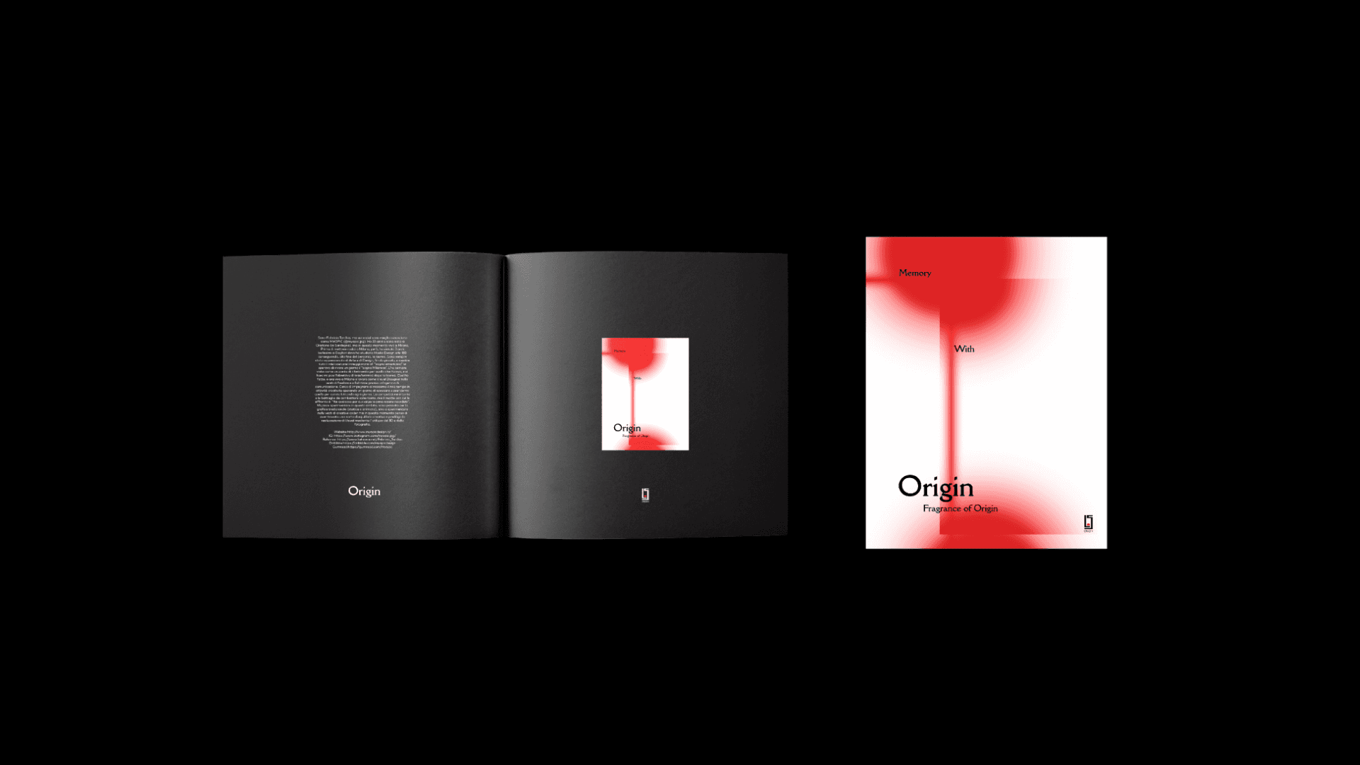
The original packaging design of Origins is inspired by the concept of connecting memories and the bonds between people. It is this subtly fading yet ever-present bond that instills a profound sense of confidence and belonging, especially when we find ourselves in foreign lands. This design eloquently captures the essence of our ties to home and heritage, resonating deeply with those who cherish the feeling of connection no matter where they are.

Example Version
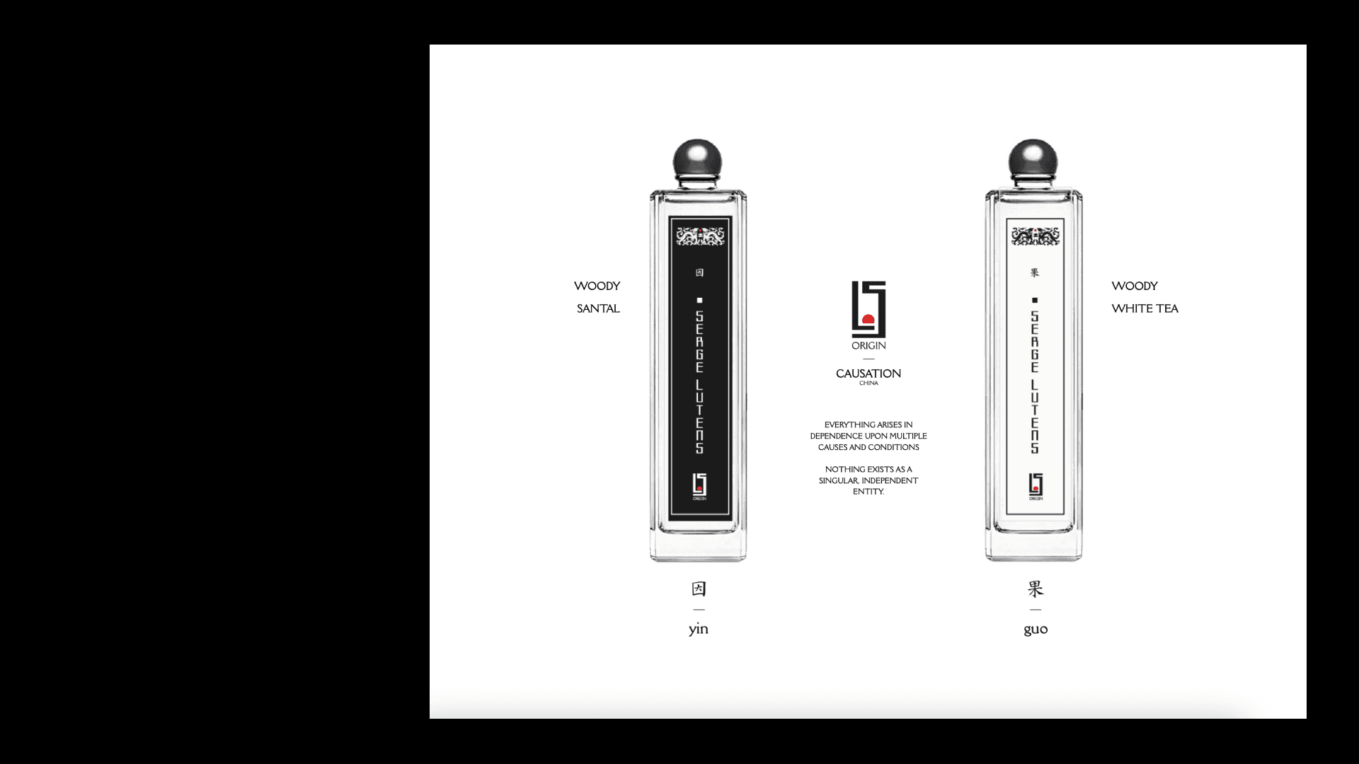
In our design for the Origins' China-inspired fragrance packaging, we've centered around the fundamental Eastern concept of cause and effect. The use of black and white mirrors the Yin and Yang from the Tai Chi, symbolizing the balance central to causality. The bottle features a slender, elongated shape, creating a sense of balance and serenity in its spatial presence. For the cap, we've chosen a silver-plated hemisphere, not only adding a contemporary flair but also echoing the graphic elements in the logo. This design decision melds Oriental symbolism with modern elegance, encapsulating the essence of the Origins brand while reinforcing its visual identity.
Thank You!
